iconcreative-agency-logo-white

Nestlé Crunch Bar

Packaging Design

THE BRIEF

As part of the renovation of the Nestlé Crunch branding, the Nestlé Confections & Snacks Division created a dark chocolate version of the classic product, which offered an expansion to one of their brand favorites. The strategy was to offer consumers a way of enjoying their childhood favorite in a modern offering that is relevant to their lifestyle. Particular attention was paid to differentiating the Dark identity as well as highlighting the appetite appeal of the chocolate that now would include no artificial colors or flavors.

icon_creative_crunch_dark_bars

THE RESULT

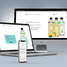
ICON created several rounds of packaging concepts for this product in parallel with competing agencies and landed much positive feedback along the way, especially for the appetite appeal on the front of the package. Ultimately, the final design featured a Dark color split on the front label, similar to some of the original designs created.

icon_creative_crunch_dark_results
iconcreative-agency-logo-white

© 2020 Icon Creative Agency. |Terms and Conditions | Privacy Policy

Give us a ring.

Stop on by.

Let's get social.