THE BRIEF
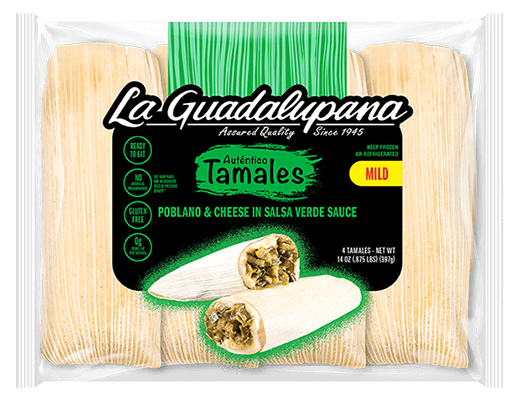
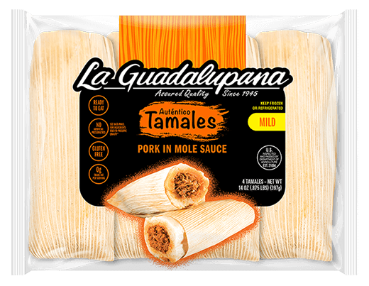
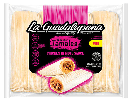
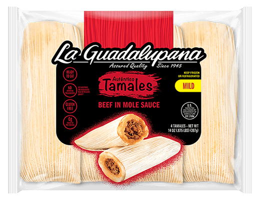
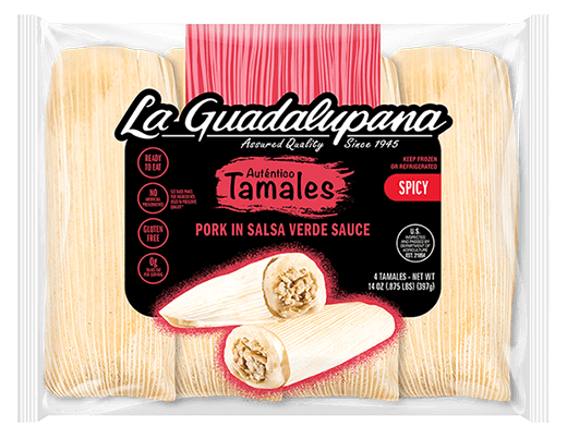
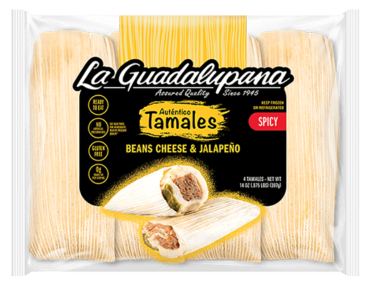
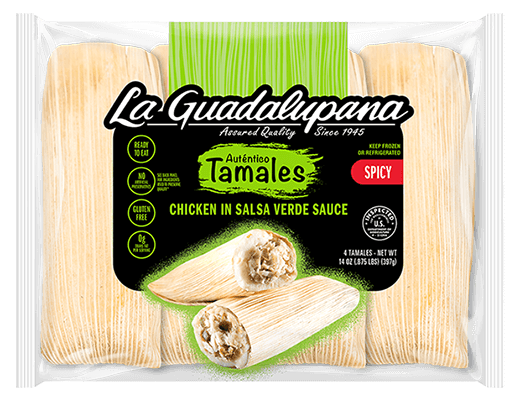
After launching new flavor offerings, La Guadalupana felt it would be an opportune moment to update their overall packaging design for a cleaner look and feel, which would also make it easier to visually distinguish all their new flavors in retail.
THE RESULT
A cleaner design approach along with a new color system maintains brand equity while allowing for easy visual flavor distinction.